24th May 2018 (Thursday)

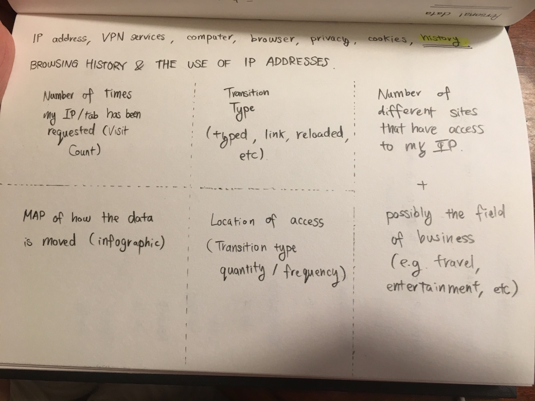
Today I finished the project and this is my finished product:


Data truths_Final.png

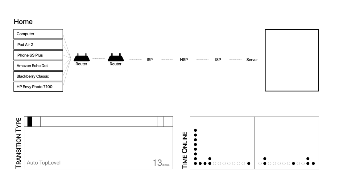
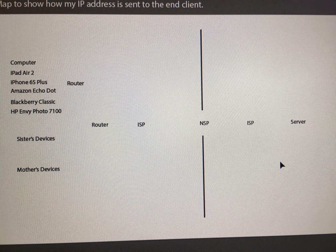
The first data (top half) visualisation shows where the internet data is transmitted and the location it is in in real-time. The location where the data is passing through will be lit up and flash to let the user know where their data is.

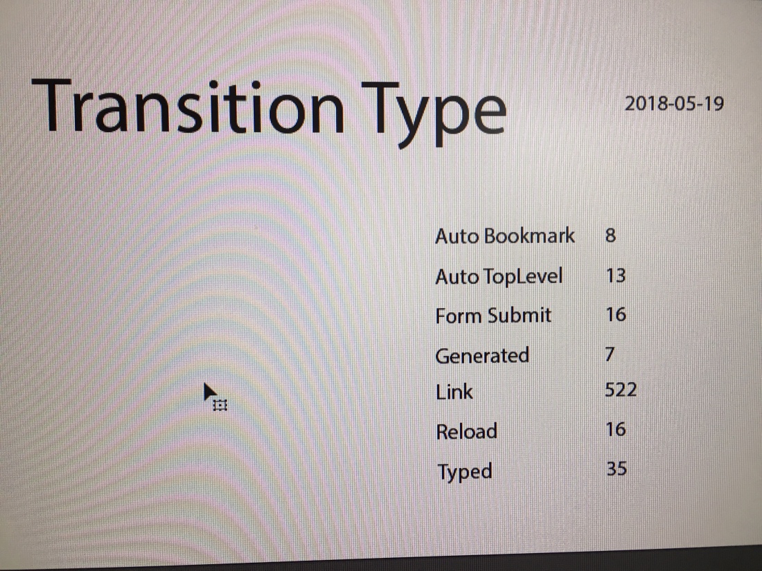
The second data visualisation shows the transition type (data taken from Google Chrome) of the methods used in order to get to a certain destination.

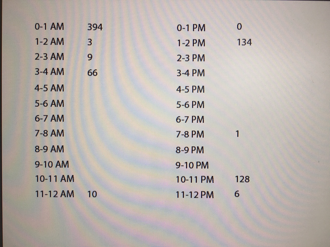
The third visualisation (bottom right) shows the time I was online.

All of the data shown is representing only 1 day – 19/05/2018.

17th May 2018 (Thursday)

Today I used the brainstorming ideas to decide the three different visualisations using the same data.

I will visualise:
1. The path from the source of the ‘personal data’ to the other side, where it is received.
2. The transition type (the process in which a webpage is opened)
3. The time frame I have been using the internet.

In order to show that data, I have used the software ‘ChromeHistoryView’ to export the relevant data as I only use Chrome for my internet browsing and it has all my information. I used the software to export 1 day’s usage to visualise my data from there. This is what the data looked like:

IMG_0682.JPG
A screenshot of the data I would be analysing for my data visualisation.

15th May 2018 (Tuesday)

Today I went through the list of places which contain personal data and decided which one to base my design on.

I thought of all the online services I showed in the previous blog post but this thought crossed my mind. Although I had considered personal data on the web, I had given little thought to the origin and the paths the data travelled through. I decided to base my design on the concept of IP addresses and the internet history and the paths taken.


IMG_0684.JPG
Image of brainstorming ideas to use in the design.